Work
FEA
Rebuilding a brand that reflects who they’ve become.
Background
Buildings age and so do brands. After nearly 30 years in business, Facilities Engineering Associates, a leader in lifecycle asset management, understood that they were not the company they used to be.
Founded as a buildings and facility engineering and consulting firm in 1992, the company had evolved into the realm of strategic asset management, helping clients with their capital planning and normalizing the expenses associated with maintaining a portfolio of buildings over decades.
They needed a way to better communicate their evolved focus to its existing markets, to enter new markets with existing competitors, and to do it all without losing the brand equity they had built over the years.
Luckily, the organization and its people had a fantastic reputation for excellent work, individualized solutions, over-the-top customer service and accountability. But, while their reputation was stellar, the focus of their work was not clearly understood by their market. Muddying the waters was a company of a similar name within their ecosystem.
It wasn’t entirely clear to even their best customers what they did and what they didn’t do.
What we did
Brand Strategy
Verbal Identity
Visual Identity
Website

Challenge
The company had built their reputation as excellent engineers and practitioners, but they no longer wanted to be pigeonholed as just engineers. They needed a new brand, messaging, and a website that drove interest and better reflected who they were and where they were going.
We faced the challenge of an existing brand legacy that was overly tactical and transactional, brought to us by a highly talented, high-performing, engineer-minded team that was, by their nature, risk-averse. The team was fearful and leadership was nervous.
We needed them to embrace risk and change, but in a way that made sense to their engineering mindset. Everything hinged on changing the lens of how they viewed themselves and getting them to align behind a more accurate vision of who they had become and where they wanted to go.

Digging deeper
We interviewed their clients and staff and found some key beliefs within those audiences that would provide the confidence they needed to make their shift and propel them in the right direction.

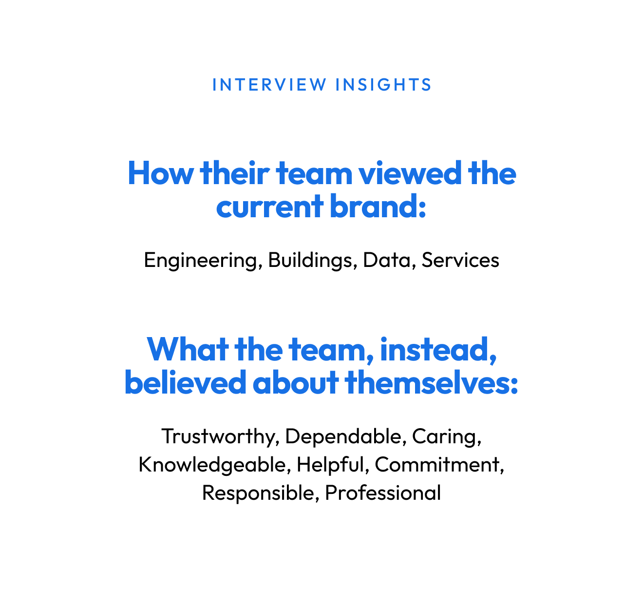
There was a clear disconnect between their current brand, how they were viewed in the market and how the team felt about their work.
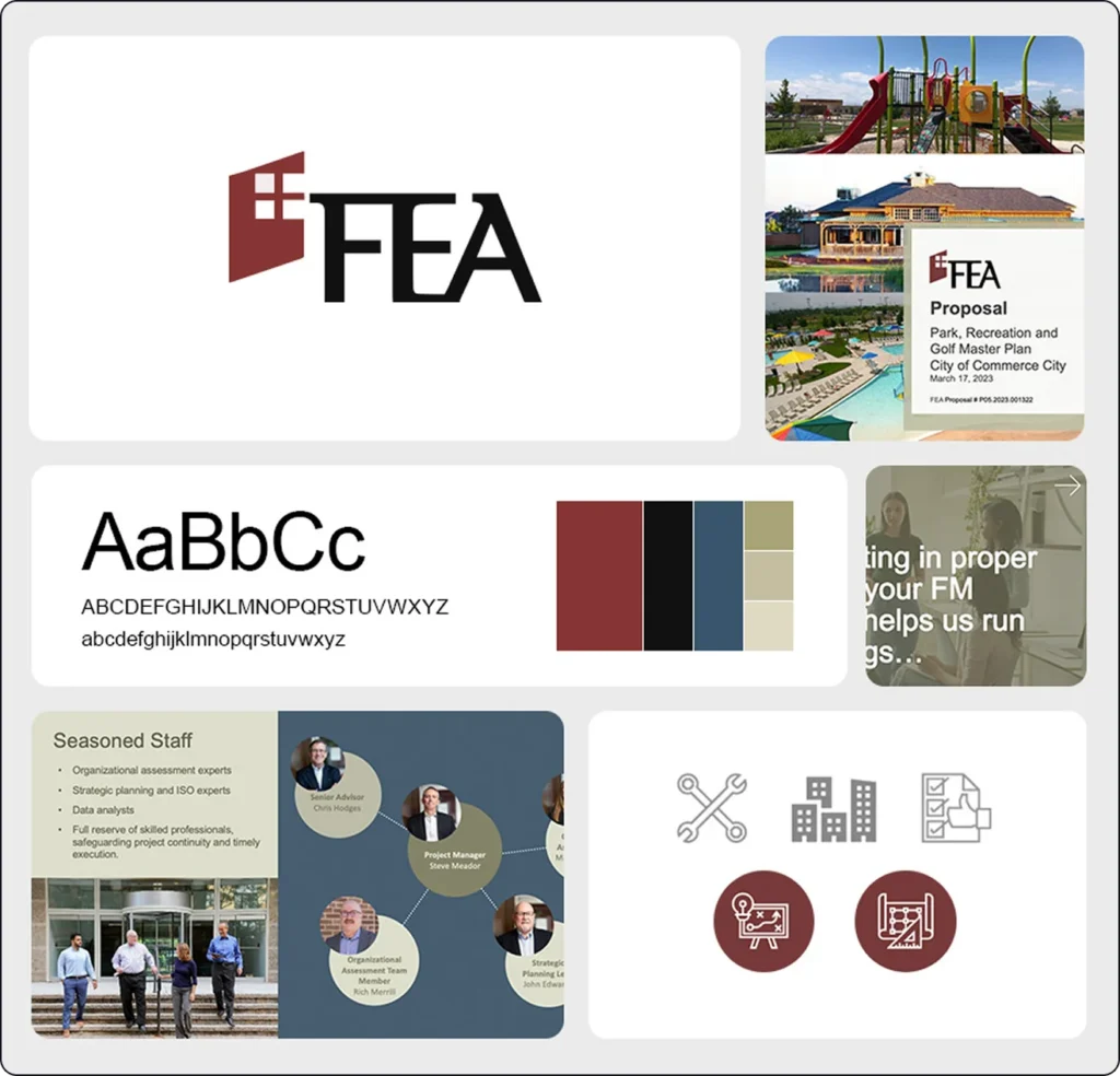

Transformation of vision
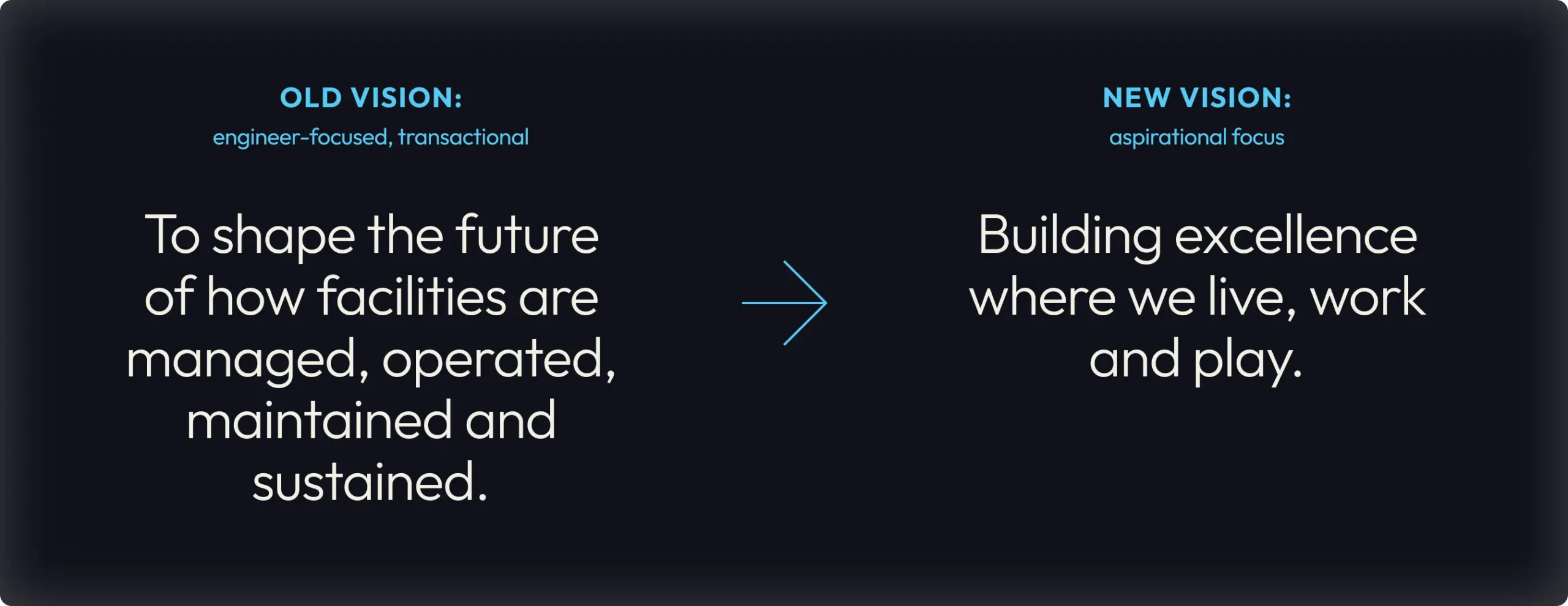
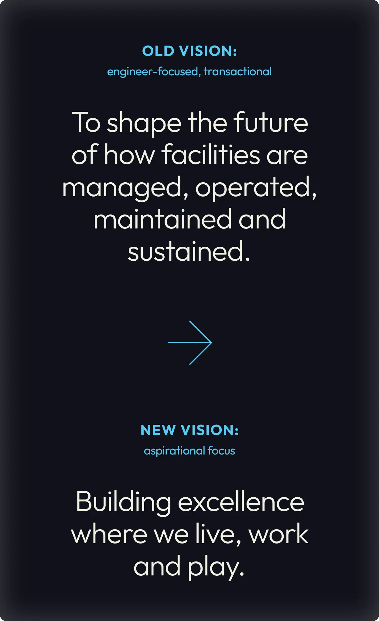
We began helping shift their vision, mission and values to better align with their new objectives and culture, allowing them to open the door to a new way of viewing themselves and expressing their brand. Starting with their vision, we guided them from a somewhat limiting vision to adopt a more aspirational phrase that better aligned with the leader’s desire for transformation.
Embracing the acronym
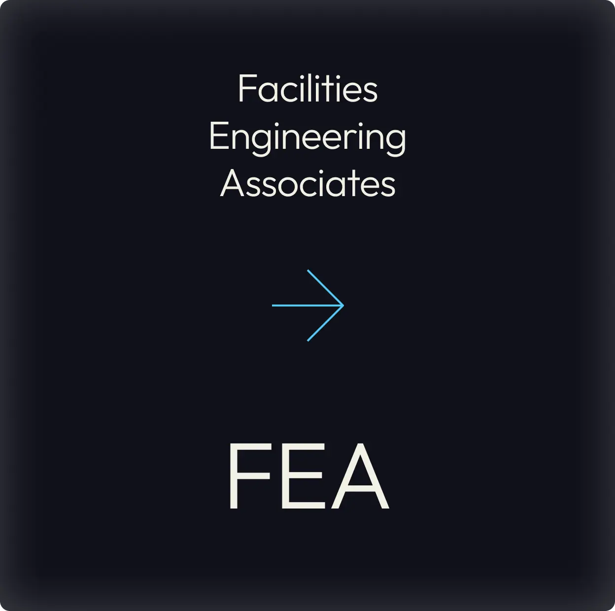
Through interviews in the Discovery Phase, we found that the company was well known by their acronym, and that it was the use of their full name that was causing confusion in the minds of their customers. We suggested building on the brand equity of the FEA acronym, which would help distinguish them from the other facility engineering group within their ecosystem, and would allow us to use the letters in a visual way to reinforce their vision to build and sustain excellence.


An evolution of visual identity
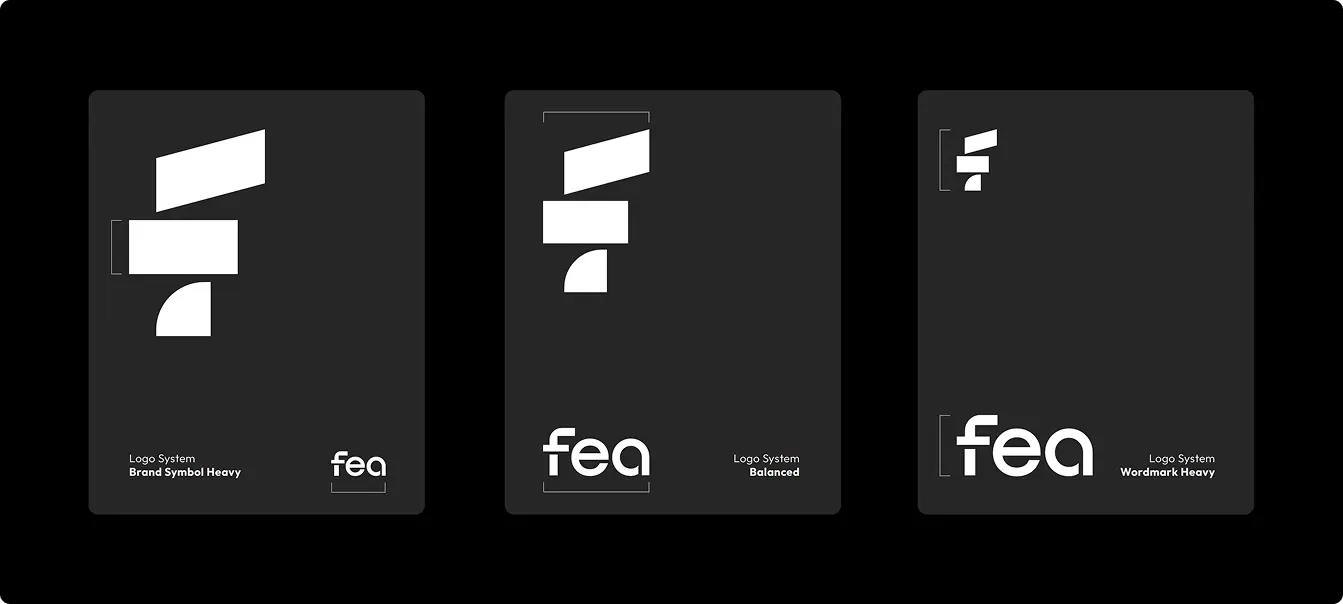
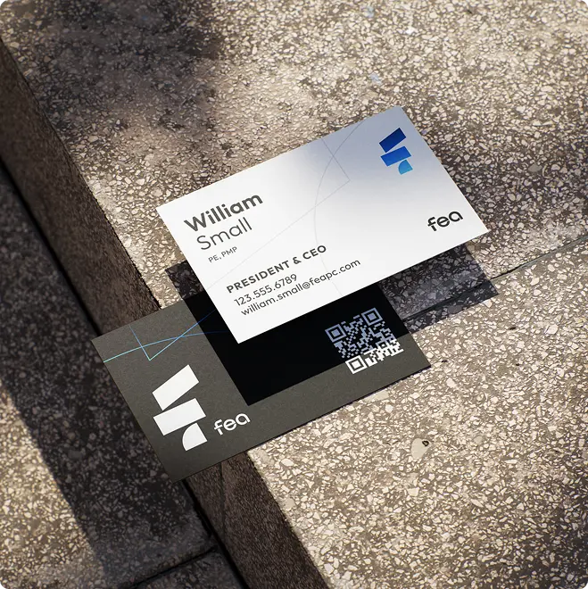
The new logo and symbol are the heart of the new brand. It builds up their heritage, while communicating with a confident, modern and renewed energy that represents their future. The clear blue sky symbol and modern yet approachable wordmark speak with an honest, respectful and direct language that embodies FEA’s core positioning.
The blocks in the brand symbol not only create a capital “F” but they also artistically capture the essence of physical structure, architectural design, and shadows from natural light. We also crafted a variation of the logo for their new website where the brand symbol morphs from an F-E-A with unique, timeless shapes, offering an engaging and creative way to build movement and energy.
This adaptive approach to the brand creates a mood that is friendly, inquisitive, and enthusiastic – it breathes life into the brand and ties it all back to the core values and tone that FEA embodies. What’s more, it gives a sense of customization and adaptability to the visual design system, which speaks to what makes FEA great and different. They are passionate, deeply experienced individuals that offer customized and flexible solutions for their clients.
A story of color
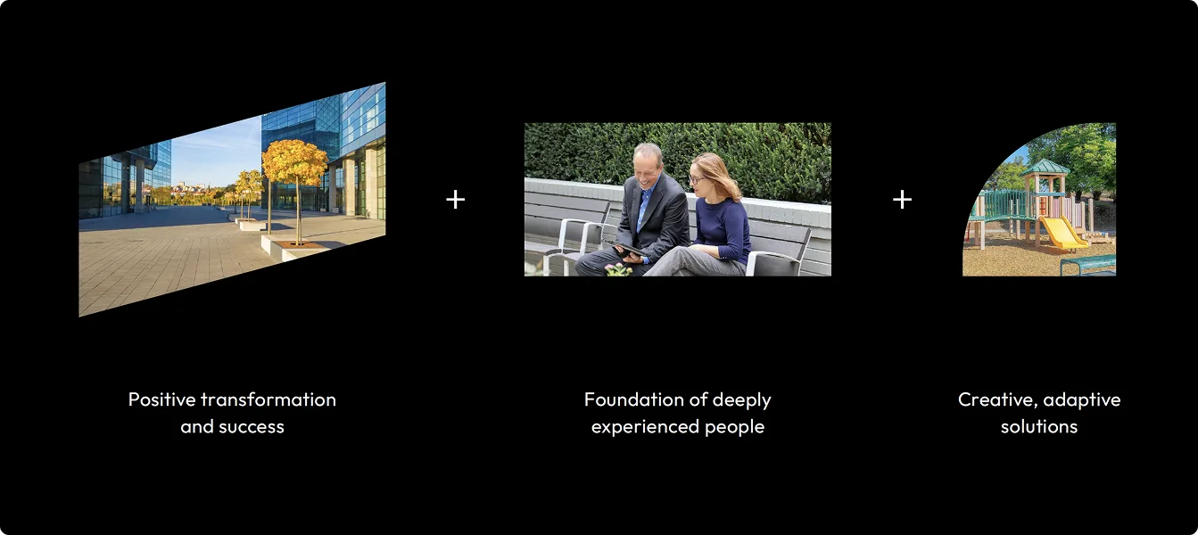
At its core, FEA evokes hopefulness, energy, and elevated perspective that leads to positive transformation, progress and connection. The refreshed brand palette is inspired by the clear blue sky and sunrise colors that are welcoming, optimistic and stress-free. Just as the warm gradient is inspired by the sunrise tones, the orange colors serve to represent the essence of what clients love about FEA – its warm, energetic, creative and enthusiastic people. Gradients also reinforce a sense of transformation – that when a client engages FEA, their built environment and bottom line are transformed and elevated for the better.


Patterning
A simple, yet infinitely flexible and engaging pattern system was crafted to reinforce the shapes of the brand symbol – a stylized, artful representation of physical structure. The shapes and lines come together as a system to bring visual interest, and attention to various focal points.

A new, immersive website from the ground up
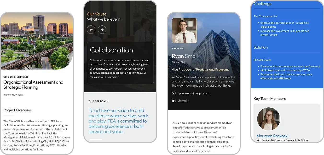
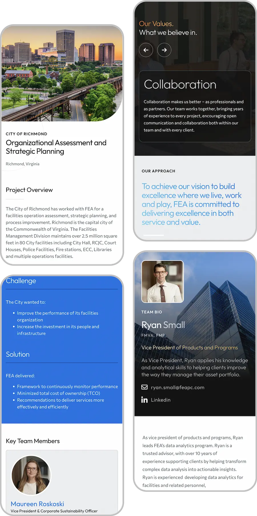
With custom video and interactions, improved accessibility and performance, and a new brand identity – FEA’s new website has transformed into a robust digital experience packed with features and functionality. The main goal of the rebuild was to craft a platform that could support FEA’s future growth, support their content marketing efforts and promote new products, and improve conversions and engagement.
From creating user-friendly service and project pages, to optimizing calls-to-actions and simplifying the site navigation, our website team carefully considered all aspects of the rebuild. Whether a site visitor was researching FEA’s past experience, or a potential new hire was looking to get a sense for the company and it’s culture, we ensured that the journey was simple and clear.
Balancing storytelling and simplicity
We created clear user journeys and simplified the site structure so visitors could find what they needed without unnecessary friction. Through refreshed visuals and improved layouts, we built a content marketing website that allowed FEA to tell their story, share client successes and insights, educating their audience on the value of capital planning.
With a more robust WordPress backend, we created dynamic relationships to connect their people, projects, insights and services together so that users would have a more relevant and holistic view of the company. This broadened perspective shines new light on FEA’s strategic consulting services and their impact.
